

~ A Guide to Colour Management for Photographers by John Fox (Original post date 2018-10-17 | Re-posted on 2020-07-28)
When we start our journey as new photographers there is a lot of learning to be done. Strange new jargon words, rules and principles, equipment and settings to be mastered. Once we crest the peak most of us focus on shooting, and the development of knowledge concerning some of the more intricate, yet peripheral concerns, fall to the wayside. I believe one such example is the subject of colour management.
It is a topic that many people will come across at some point in their research, but it is a broad topic and seems of little immediate significance. In fact, most people are only concerned about it and how it impacts their work after they understand it. So until you have wrapped your head around it and how it relates to your end product, it is generally ignored. In my experience, this means colour management is something that sneaks up on people during a crisis, usually during a project with an imminent and looming deadline. So most new photographers deal with this issue reactively and during stressful circumstances. For this reason, we include the subject of Colour Management and subsequent processes in our Advanced Photography Course. It is really that important for Enthusiast and Professional Photographers alike.
So, I really hope that this Guide to Colour management for Photographers will help to guide you through the concept of colour management to better prepare you for the time when you want to include it into your workflow process.
Accurate colour
Let me give you a real world example of how colour management might relate to the type of work we do. I did a shoot which highlighted the importance of correct management which I would like to share with you. The client was entering a hair stylist’s colour competition. Basically a “who can colour hair best” competition. It was therefore important that the colours were accurately reproduced.
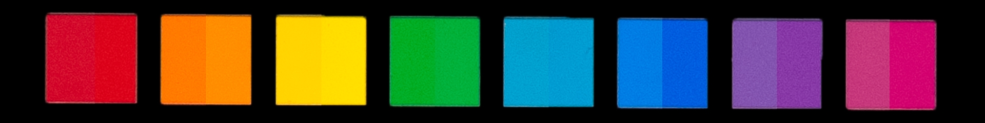
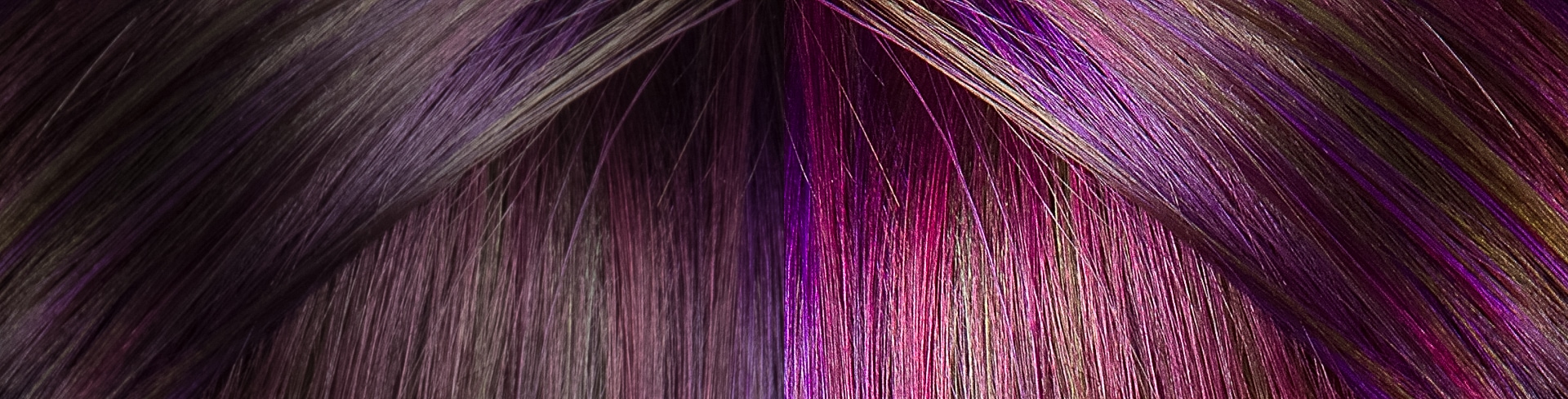
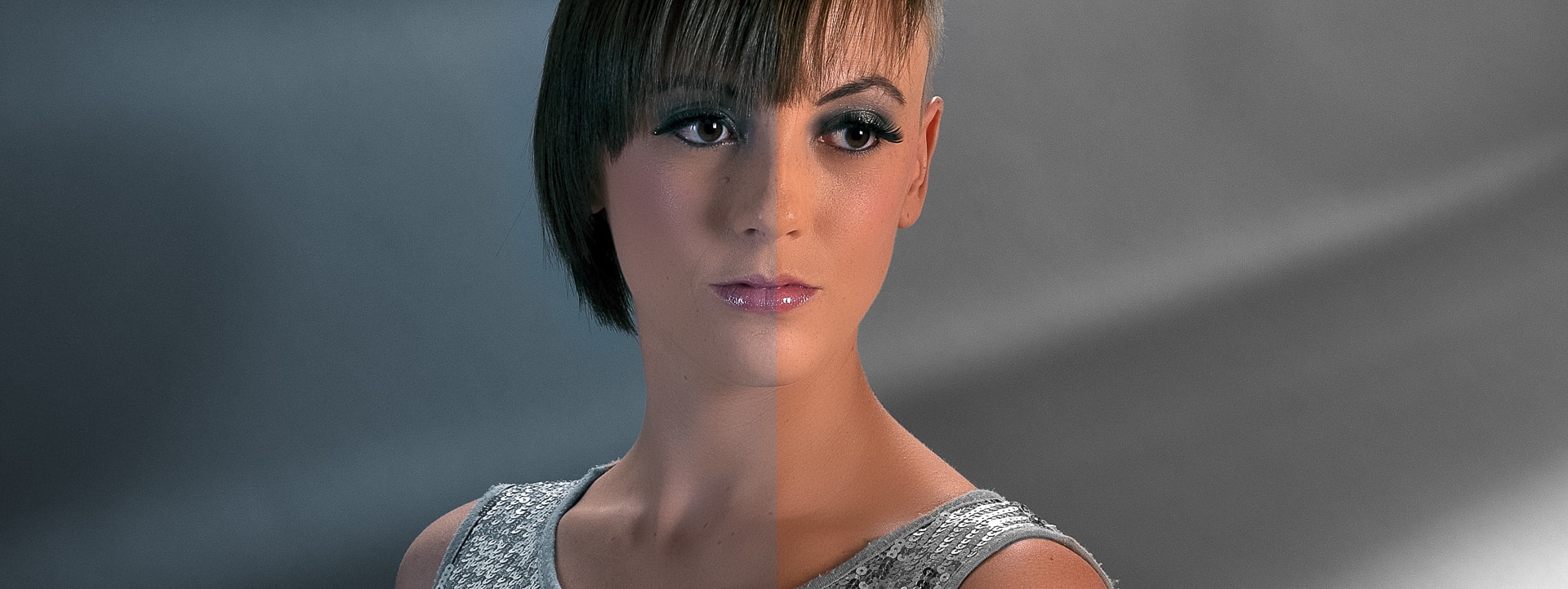
It turns out that our eyes cannot be trusted. There is just way too many variables, biases and individual perceptions and confounding factors. Our eyes are incredibly adaptive and therefore too forgiving. When it comes to accurate colour we really need more science in the workflow. To add to the complexity, the equipment we use has its own shortcomings. Below is an image split in two. The left side shows the raw image out of the camera. And the right-hand side shows the image after a colour management process has been applied.
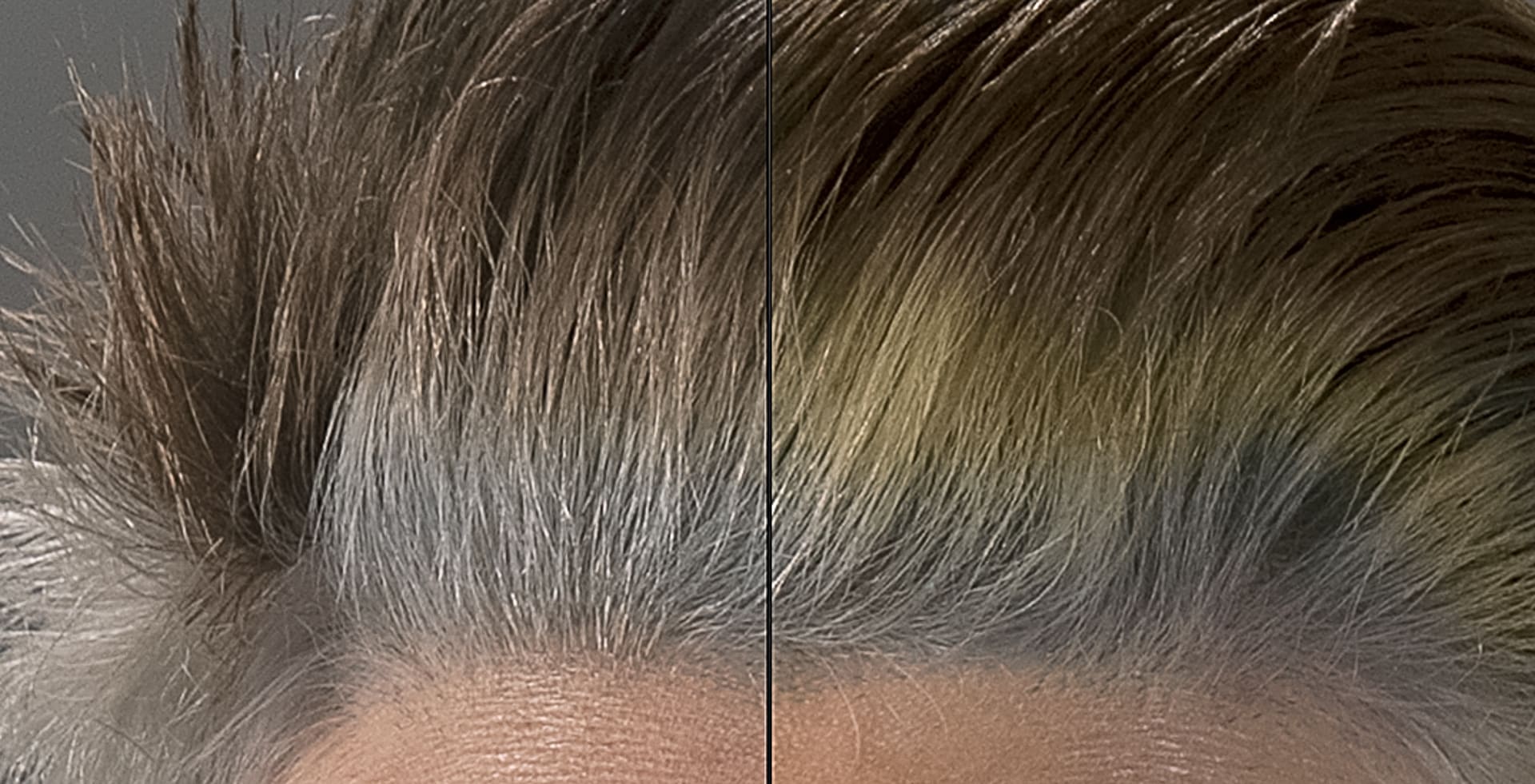
There is a clear difference between the two halves in that there is a third band of colour visible on the right which is not there on the left. The scary thing here is that the yellow band of hair was present and the camera has not reproduced it. It is only through the application of colour management that it became visible. The reason most people do not deal with colour management is that this level of accurate reproduction is not necessary or obvious in most photos.
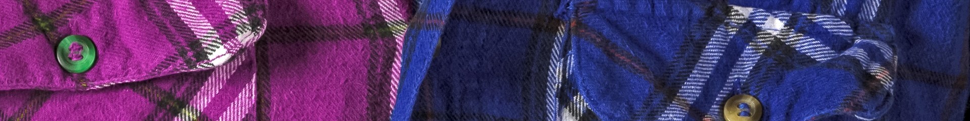
This strip of the sky may or may not be accurate, it is hard to say as we were not there. It also matters very little whether or not it is a 100% accurate reproduction of the scene. In fact, a lot of subject matter in a shot can be way off and no one will know as they may have no point of reference. For example, one shirt can be represented as both blue or pink, the viewer has no frame of reference to what the shirt is supposed to be.
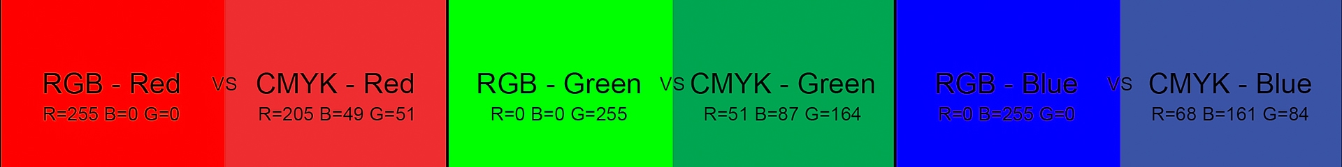
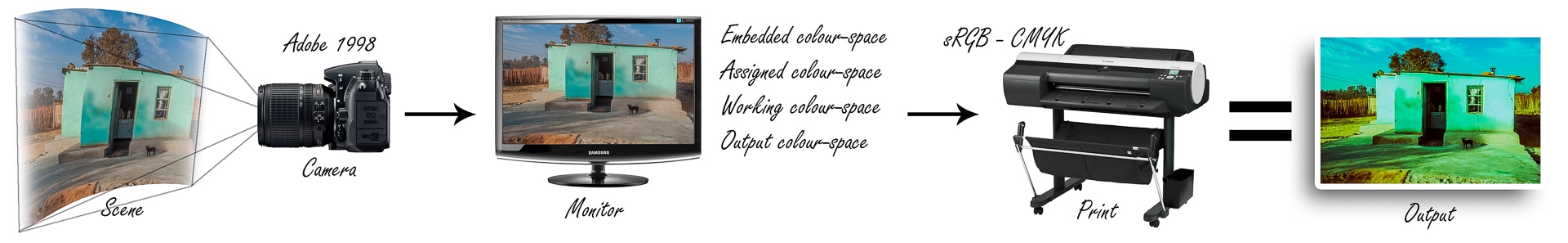
This inaccuracy of colour has nothing to do with white balance but rather the accurate reproduction of colour, hue and saturation of your images from the shooting stage through the editing stage and onto the printing or output of your work. Colour management is a field which incorporates colour gamut, colour space, ICC profiles, additive colour, subtractive colour, calibration, and colour temperature just to name a few. These are realities present in every stage of the working process faced by a photographer.
What if your ambition does not include corporate work or products which require accurate colour, does colour management still matter? In my personal opinion, one of the most important colours to get right is skin tone. If your skin tone in an image is off, everything looks wrong. Skin tone is something people have a preconceived expectation of, and if that colouring is wrong, then everything is wrong. If you are interested in learning more about portrait photography within a practical and classroom environment join our upcoming Portrait Photography Boot Camp. When it comes to colour we are unable to be objective and that is why colour management, through the various calibration processes, is essential.
Still not convinced?
Then tell me what colour is this dress? Gold and white or black and blue?
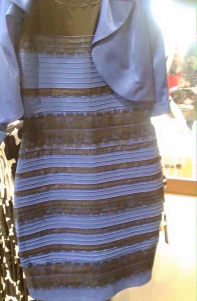
This is why colour management is so important
Gold and white? or black and blue?
If you have been living in a cave, this image has been described as “the dress that broke the internet”. The question of whether it is gold and white or black and blue seems immaterial as the answer is obvious to you. However, the viewing public has a thirty percent, seventy percent split on the answer. As inconceivable as it seems there are people who see, as clearly as you do, the alternative colour combination. So our perceptions and interpretation of colour cannot be trusted.
Hopefully, I can convert a few people and together we raise the level of our products and services. There will come a time when colour management does matter and this is not an obstacle you want to overcome in a crisis situation.
Let’s deal with colour management during the shooting stage of your workflow process. The idea here is to cut down on the guess work during your editing, and get accurate representation of the subject matter you are shooting. Correcting white balance will only get you so far as it helps to correct over all colour shifts. This is the process to correct the accurate representation of every colour on an individual basis, for accurate depiction.
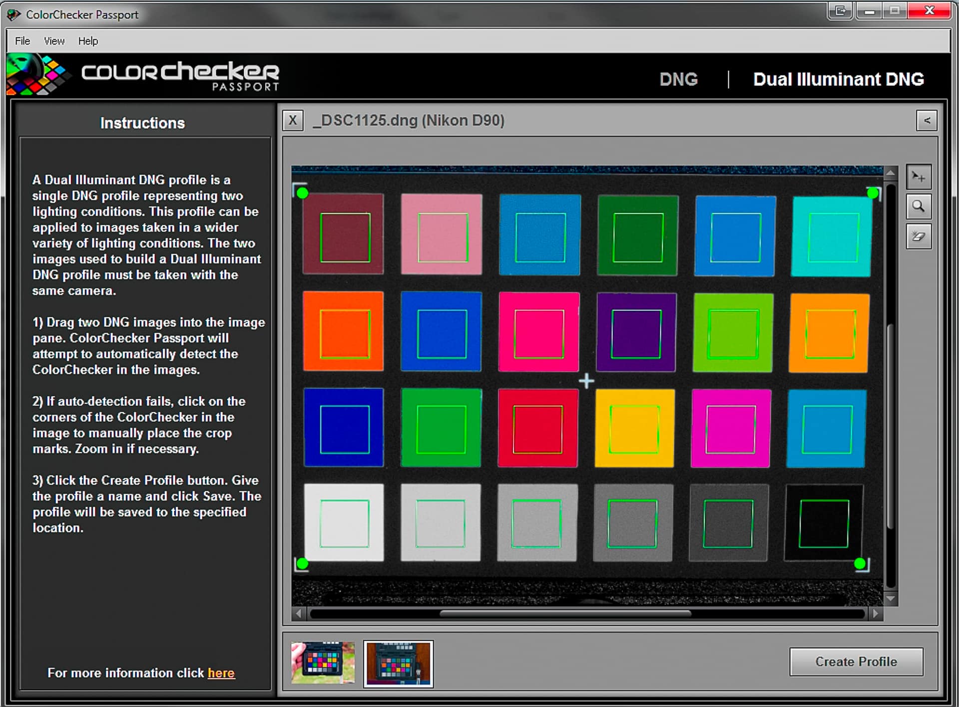
There are many tools and techniques to overcome the challenges of white balance. These can be summarised as follows… shoot RAW. What I want to share with you is the “X-rite ColorChecker Passport” a powerful tool in the photographers arsenal. The ColorChecker Passport is a wallet sized hard plastic case. Inside are a variety of colour swatches that represent a type of gretag macbeth card. These represent colours that are consistent, precise and predictable with known RGB values. The bundled software compares what the camera captures and adjusts to the values it knows each swatch represents.
This is how easy it is to do.
- Step 1: During the course of your photo shoot, you capture a shot of the face showing the colour swatches. I generally tend to do this at the end of my shoot because by that stage I have settled on my lighting which evolves and gets tweaked throughout the shoot. If you are doing more than one setup (and not just fine tuning) shoot the ColorChecker Passport for each setup.
- Step 2: Open the image in Lightroom which contains the Passport. Right click, select export and choose “X-rite software”. Your purchase of the colour checker comes with bundled software that plugs into Lightroom. This gives you the option to export directly into the programme; the software creates a profile which it then loads back into Lightroom. Unfortunately you need to restart Lightroom for the profile to appear in the develop module.
- Step 3: Apply tis profile to all the images for this shoot. In Lightroom’s develop module, the last menu item is camera calibration, here you select the profile created for that shoot and apply it to all the images.
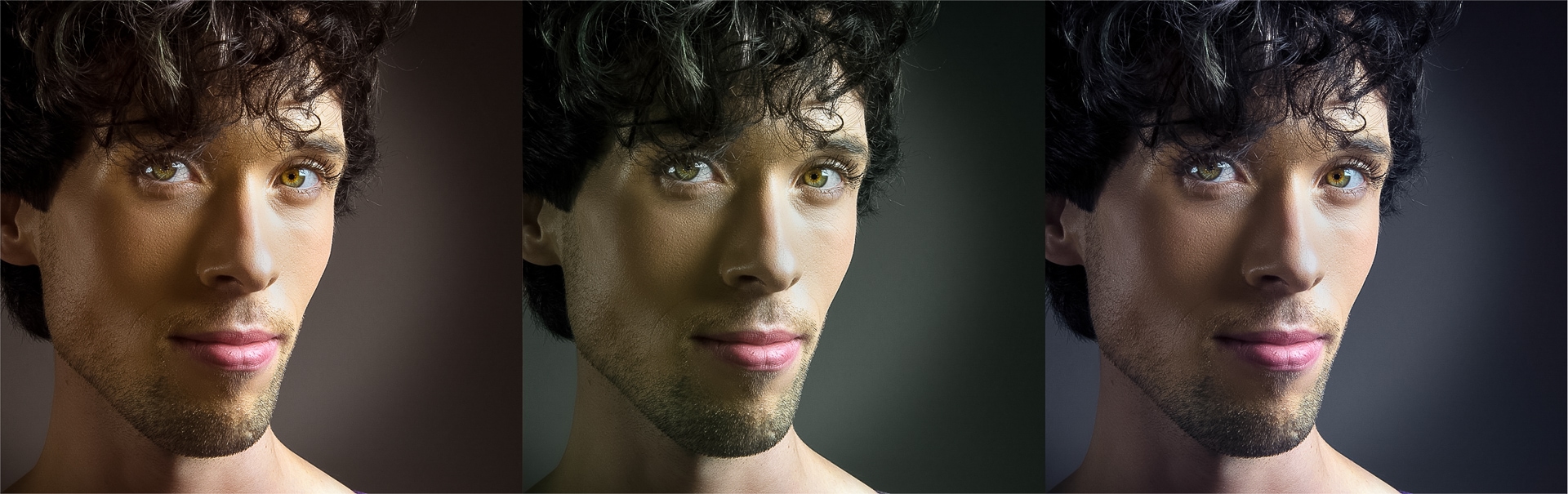
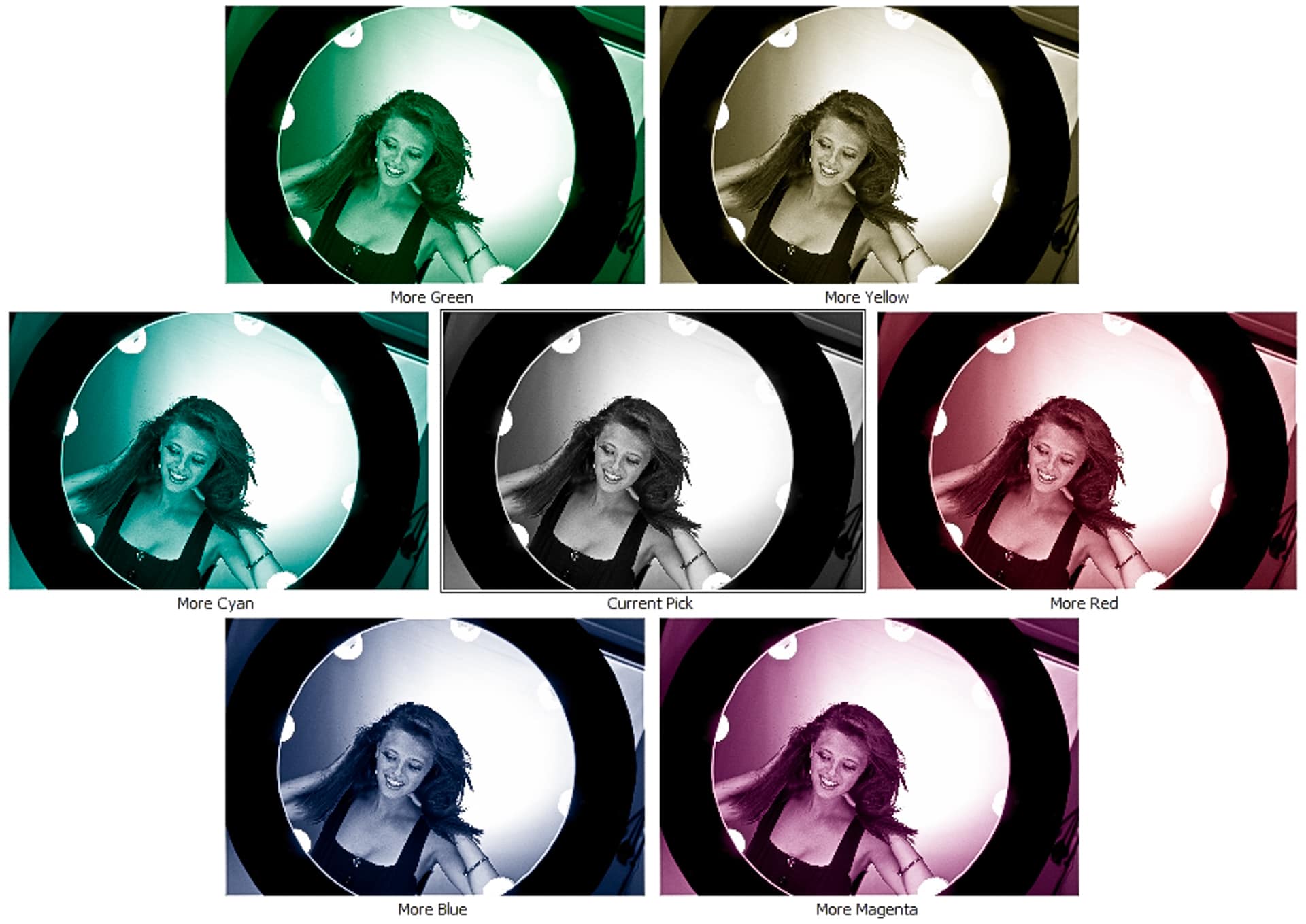
And here are the results…
This is one row of swatches to give you an idea of the changes applied. It is important to note;
- The left is before (out the camera) the right is after (profile applied).
- The changes can be quite substantial.
- The amount of change in not uniform across the range.
- Some colours hardly change while others need both hue and saturation adjustment.
Compensating for your camera sensor’s colour shortcomings
Here are a couple of points you should know in order to better understand, and utilise the power of this tool. Let’s start with how it does, what it does. The software analyses the image you take of the passport showing all the little colour patches. It finds the swatches within the image using image recognition software. Once it knows where the swatches are and how they are laid out it compares the recorded values against the expected reading and adjusts them individually, accordingly. This process overcomes the shortcomings of your sensors response to colour interpretation and flaws within its calibration.
These swatches include black white and grey, this means you do not even need to first do a white balance for an “accurate” base to work from. The software is perfectly capable of working out the individual colour shifts and their corrections even with a white balance that is completely off. This has two advantages, firstly you can use this from any base, intentionally warm or cool images do not need to be made accurate first and then readjusted for mood. This is a process dedicated to the sensors interpretation of colour independent of lighting. The second advantage has to do with importing into Lightroom, but first let me discuss dual illuminant DNG profiles.
Dual Illuminant DNG
The bundled software can create profiles for you, or you can export from Lightroom which is a very easy and automatic process. There is one more trick up the sleeve though, dual illuminant DNG profiles. You photograph the ColorChecker Passport under two different lighting conditions, daylight and tungsten while adjusting the camera white balance setting accordingly. This results in two images that should look pretty close but gives the software a lot of information about how your sensor is handling a variety of conditions. The software then creates a profile that is specific to your camera and covers a multitude of shooting conditions.
You now have a profile that can be applied to every shot, on import, into Lightroom that is accurate and specific to your camera. It is a great feature Lightroom has, allowing adjustments on import, and this is a particularly relevant one. You will now open you “recently imported” folder and find at least one aspect of the editing process is taken care of. In editing it is very important to start with a good base on which you can build.
Each camera, independent of model and make will respond differently. You can therefore not download a profile from the internet, as you will need one for your own equipment even if you have two identical models each will respond differently. If I look at my camera before and after applying the profile, I see a big adjustment being made to the colours represented by skin tone. As I mentioned previously, getting skin tone is very important. By running this profile my portraits benefit greatly, and my time fixing colour is greatly reduced, but most importantly, I’m not guessing.
Let’s have a look at colour management during the editing stage of your workflow. This is the moment where you have captured your images and you are now working on your computer to get the most potential out of your images. This article is going to deal with monitor calibration, working towards getting your screen colour to be as accurate a representation as is possible.
A disproportionate number of working photographers have no calibration on their screens. They look at the image and are happy with the results, so why is calibration important? A modern pc screen is pretty good at representing colour, as it is bright and rich with vibrant colour. A cheap screen today surpasses an expensive screen of yesteryear. In isolation they seem very good, but this is because our eye is so very good at adjusting and compensating. If you open a blank page in Word you will have a predominantly white screen, hold a sheet of white paper up to the white screen and compare them.
The first thing that should strike you is how differently they are represented. I don’t mean colour but the fact that the screen is backlight and the paper is not. This is why translating from screen to print is so very difficult, they are such different principles. That aside, you will probably notice a difference in colour. Bear in mind that photo paper can also be a much purer, crisper white than the printer paper you are holding against the screen, thus making the difference even larger. Generally laptop screens are particularly blue or cold in comparison. If you did this little test, and can visually notice a difference, you can start to see how off your monitors colour can be. This is further affected by changes in ambient lighting, temperature and the age of the screen.
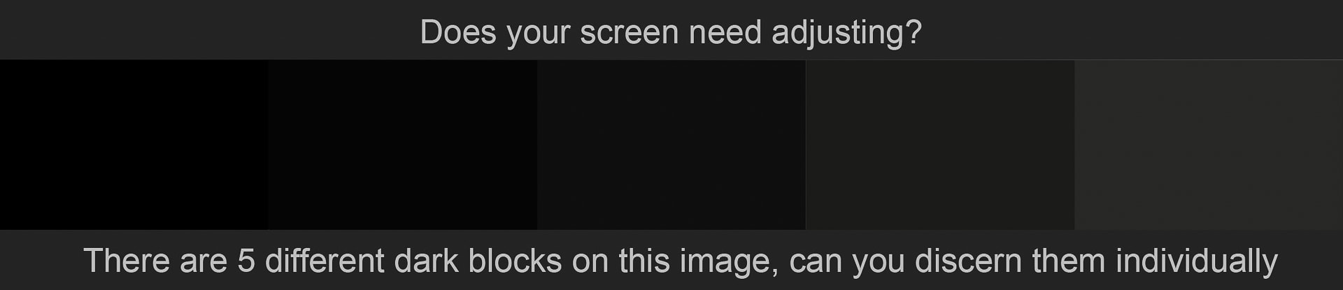
Is your screen calibrated?
If you compare a blank page on the screen to a blank page in your hand, how closely matched are they? Okay, so let’s assume there is a difference… how much does it matter? Many people may well be saying it is a marginal difference and clients so far have been happy with my work… therefore it is fine. The impact due to a lack of colour management only comes into effect further down the line and during a crisis, inevitably. The work you do suddenly displays differently on the clients TV, or PC or iPad or worst of all when it gets printed. Now you try correct for the inaccurate colour but you stabbing desperately in the dark as your compensating adjustments are no more than a “hit and miss” approach. The problem has been there all along but a discerning critical eye exposes the issue and suddenly you are in over your head.
The end product of your work will generally be either a print or something displayed electronically. You can work towards processing them optimally for either form of final medium, and then they will print accurately and predictably. You unfortunately have less control over how they will be viewed when you place something on the internet as you cannot control the quality or settings of every viewer’s screens.
What is the right screen?
Weather you buy an LCD or LED both offer pretty good quality and colour gamut. It is very difficult to create a buyer’s guide as the products change very often. My recommendation is therefore the following points for consideration when next buying a screen. Firstly, the more you spend the more control you will have over the colour. As the technology is similar across the range one main difference between high end and lower end products is the amount of control the menu allows for, thus enhancing the extent of fine tuning of the colour settings.
The second consideration is contrast range. Many monitors are advertised as having a contrast ratio as high as 5 000 000:1, which is often done through a processor. These are marketing specs to entice us, as a photographer however you want something much lower. A professional monitor may have as little as a 2000:1 ratio. This seems counter intuitive; surely we want as much contrast and therefore tonal range as possible? The reason we don’t, is because when we print it offers nowhere near the same contrast range as a screen. We then edit our work to a different standard and capability of the final medium. It becomes very difficult to view your work on one of these screens as they are not a close match to the final print.
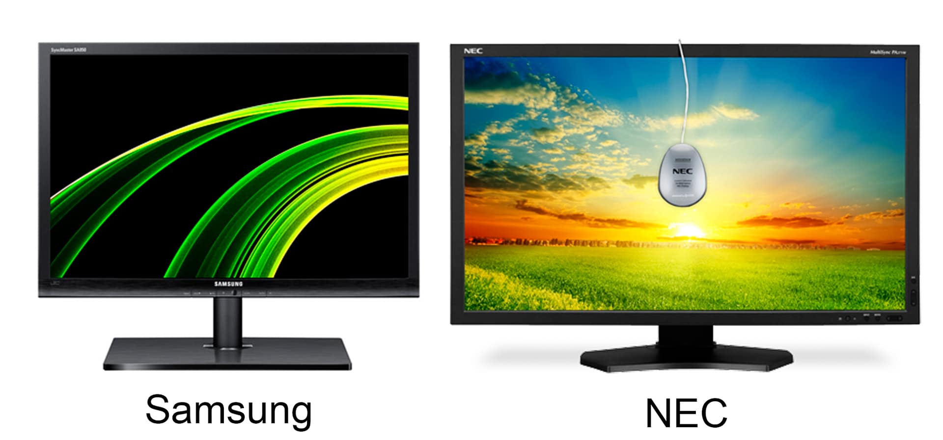
To sum up, my recommendation is to look at the Samsung line-up as they have very good monitors across all price points. I have calibrated a couple of models in the 3 000 Rand price range that needed very little adjustment for their out of the box settings. In general they tend to be slightly cool in their colouring and the calibration warms them up. Having sung Samsung’s praises they also were just awarded a TIPA accolade for “Best photo monitor” for their S27A850 series. Alternatively you can splash out on an NEC monitor which retails for around R 24 000. These NEC’s have an exceptionally good coverage of the AdobeRGB colour gamut and a contrast range of 1000:1 so you can get a fair idea of what your final print will reproduce as.
The way to go about calibrating your screen is through a piece of additional equipment called a screen calibrator. Several are available through companies such as Datacolour who make the Spyder, or X-rite who make the ColorMunki. These devices are positioned on your screen and measure the colour displayed as the bundled software runs through a series of display patches. The software displays colour swatches and the device placed on the screen measures the output. It compares the RGB value of the swatch to the screens rendition, and calculates the discrepancy. The resulting profile is then run on the PC to adjust the output. Every time you start up your PC you will see the original colour and as the background programme boot you see the profile get loaded and the screen flicks to the calibrated colour, this is always a moment of satisfaction for me as the accurate colour pop into effect.
Blue colour before calibration | corrected screen colour with calibration running
Calibration tips
It is important to note that your screen should be on for at least 30 minutes before you attempt a calibration, this allows it time to warm and for the colour to settle. You can also calibrate TVs, projectors and additional monitors; remember however the profile you create for these displays live on the PC hard drive. This means the profile only works when connected to the PC if you unplug it and use it on its own, it is running without the created profile. The high end version of the NEC display is capable of embedding the profile meaning the screen takes the calibration with it wherever it is plugged in.
The screen of your PC or laptop is adversely affected by ambient light and particularly changing light if you have a window with daylight pouring in, note that it changes in intensity and colour temperature throughout the day. It is also good practice to work in a neutrally coloured room as the wall colour can impact your perception of colour. Some professional editing spaces are covered in neutral grey from carpet to ceiling.
My best tip for assessing the colour of your image is to take a break, walk away and come back after ten minutes. When adjusting colour you can easily see improvement from the start to the end point. This improvement often satisfies me, until I walk away and come back, I can only then see the colour is still wrong. As you correct an image which is for example too blue, you add yellow. You flick between the before/after and see vast improvement. Only after leaving and returning to the image to you regain enough objectivity to see that although you have fixed the issue of the excessive blue, you now perceive the need to add magenta. The lack of warm reds is only noticeable after a break, which allows for some objectivity and fresh perspective.
Is calibration really necessary?
So who needs to calibrate their screen? Any photographer who takes their craft seriously and charges for their services should have calibrated screens. The devices for calibrating screens are around R 4000 to R 4500. Calibration needs to be updated once a month to maintain its accuracy. It becomes and invisible aspect of your workflow as once you have set it up it is just running in the background. The reason it is so important is because every screen needs adjusting in order to be used for photo editing, and it is not possible to do by eye alone.
Screen calibration may seem an expensive luxury, my suggestion is that when you are ready to deal with issues of colour management within your workflow this is your first purchase. It can feel expensive and the first calibration may seem so marginal as to be insignificant. If you can see any change when toggling between the before and after profile, then it is worth it. Over time you develop a lot more confidence in your work and product. Dealing with printers and getting them to deliver the product you expect also becomes a much more surefooted process. This simple change will help you raise your work to the next level of professionalism and that can be deeply satisfying within it self.

Output includes a variety of media including web, screen, projection, silk screening or any other number of choices. There are so many, that they are beyond the scope of this piece. I am going to focus on printing as it is an area you may have some level of control over, as opposed to many other outputs where you relinquish control to a third party. Modern high end inkjet printers are now capable of better results than a traditional lab print. New printers can have many, many colour cartridges allowing results far surpassing traditional CMYK limitations.
Having said that, more often than not, printing is entrusted to third parties beyond your influence. I have written these articles as they are matters important to me. This is an opportunity to challenge photographers who undervalue printing, and hopefully I can change some traditional thinking. Firstly, as a photographer you are primarily a service provider. Your final interaction with the client however, is the exchange of product in one form or another. While we are generally considered to be in the service industry it is the final product which we hand over, and against which, we are ultimately judged. Once you hand over the responsibility of printing to a third party or worse give the client a DVD, you lose control of the final output of your artistic vision. The final product may now get cropped differently to your intention, the colours can shift, contrast can change etc.
The list of ways your work and editing can be screwed up is actually quite long. The problem is how your work will be judged; a ruined picture with green skin tones is greeted with “gee, who took this picture”. The question is almost never asked “who printed this picture?” the end result/product is a reflection of the photographer and not the last service provider in the production line. I hope this gives you a glimpse into the importance of you asserting your personal stamp on your work, and that editing is not the last step.
The second point I want to make about printing is that there can be considerable margin of profit to be made if you do your own printing. If you don’t have the same high running costs as a store, you can get away with printing your own work for far less than you they charge. The larger your prints, the bigger the margin, if you want to print a “postcard” sized print, the store will be able to do it far cheaper than you. If you want something bigger, say A2 sized (61x42cm) you can print this at home for 1/5th or less of the stores asking price. And you can do it both at a higher quality and to your personal preference.
Printing problems
Most photographers I have spoken to say that printing with 3rd parties is their biggest frustration particularly in achieving consistent results. So enough jabbering, I will now discuss the issue mentioned in the title, colour management during the printing phase of your workflow. Perhaps a disclaimer is pertinent here; I am no expert in this field… I am just a guy who has struggled his way through and hopefully what I have learned can save you from some of the battle.
Printers work on the subtractive colour system, the more colour you add the darker the resulting mix. This is the exact opposite to the screen you have been working on, and editing the image on, in preparation for your final print. This highlights the problem, colour spaces, dyes/pigments, icc profiles, substrates, subjectivity, colour gamut, and bit depth are all factors working against you or need to be taken into consideration at the very least. As this is an article and not a book, most are beyond the scope of what I can cover here. The point I am making is colour management is a big field, and consistent accurate results can feel very illusive.
Printer calibration
The road to achieving consistent and predictable results on your printer are through ICC profiles and calibrating your printer. There are a variety of papers available today for printing, each one response slightly differently though. An ICC profile is a data file that helps the translation from (in this case) the colour information from the screen to the interpretation of that info onto the paper. This means you need an ICC profile for every printer and paper combination. These are generally available for download from the paper manufactures website.
ICC profiles are generally easy to implement and help towards accuracy, the confounding factor is the vast variety of papers now available. Papers can loosely be divided into photo and fine art categories. These can then be subdivided into textures and divided again into shades of white, which include warm, cool and pure white. You will go bankrupt trying to stock every version and grammage of paper available to you. My suggestion is to try breaking it into a few broad categories, and stocking the most “average/representative” example within each range relevant to your needs. There is an ever growing product line-up and you can simply not use or stock all of them, there tends to be very marginal differences between paper stocks within any particular range.
I do not want to underplay the importance of matching your image to the right medium, the impact of which cannot be over stated. However it does not justify having every single variation in texture and tone which any given manufacturers range has to offer. The impact warm white may have over pure white for a given image can keep the connoisseurs debating indefinitely. The reality is, in my opinion, that the different is only ever really appreciated in a direct comparison. In Isolation when viewed individually, the difference diminishes to a point of negligible significance for 99.9% of the viewing audience.
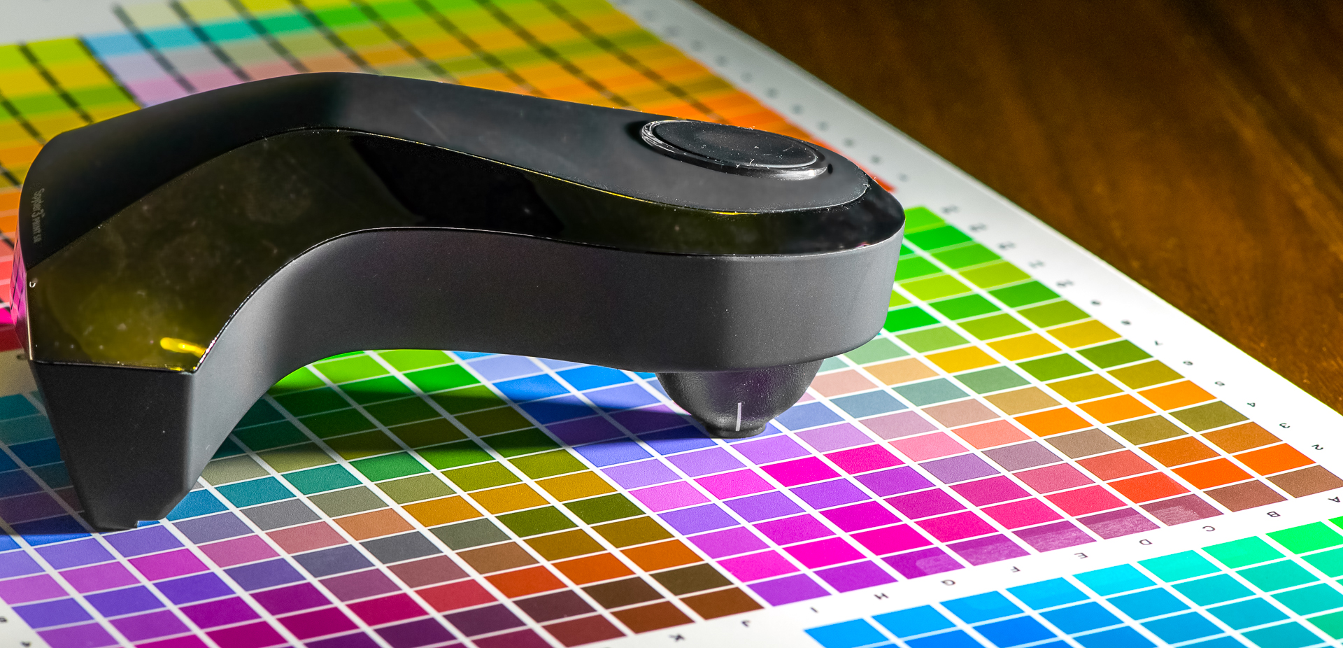
Spectrocolorimeter
An additional tool is available to create consistent results, this tool allows you to create a custom profile for your printer. This is done with a spectrocolorimeter and its bundled software. You print the test page provided by the manufacture which is a series of swatches on a page. You then measure each printed swatch with the spectrometer and it calculates the intended print colour against the actual printed swatch colour. The software calculates the discrepancy and creates a profile which boosts, shifts, adjusts and saturates as needed. This gives you a profile that you select in future when using that paper stock in conjunction with that printer. Photoshop and Lightroom offer the option to allow the printer to manage the colour, and then under printer preferences you select the profile you created.
This means you will get consistent colour print after print. You may find a discrepancy between the screen and final print due to a variety of external factors and limitations. The advantage you now have is a consistent base from which to work and tweak your adjustments. If this is done through an auto setting your changes plus the printers interpretation of the new changed information results in a different amount of change between each print. The reason I keep going on about “consistency” is because even if the print is wrong, it will be exactly the same “wrong” each time. This is much easier correct and compensate for.
To buy a printer and the equipment to calibrate it, as well as a selection of paper stock is a huge investment. After reading this article I hardly expect everyone to rush out and purchase A1 printers and 30 meter rolls of paper stock. I would however like to plant the seeds, and start to change some of the thinking and importance that photographers place on output. I hope this is helpful to someone who is starting down the twisty road that is colour management. I sure would have appreciated reading it a year ago.
John Fox is a DPC Lecturer. Visit his personal website at http://johnfox.co.za
Thank you for an amazing lesson, John.
Great discussion. In the past I have used a spyder to calibrate my screen. Color was not a problem, but my screen could not be adjusted enough to hit the targets for brightness. Has anyone ever run into that problem? I need to get a new monitor and want to make sure I can fully calibrate it for lighting as well as color. Thanks.
eye opening! A great help for just starting to work with photo images…..thank you!
One word “Powerful “
Thanks for posting this John. I have been considering this for a while, and this article prompted me to buy the ColorMunki and ColorChecker Passport. I’m not a professional, but I would like to start looking at selling photos, and I definitely don’t want issues with colour representation if my photos are printed. So thanks for giving me incentive to get these tools.
Thank you for sharing this valuable information.
An interesting and well written article which is easy to understand. Thank you.
Thank you. A very comprehensive, yet understandable article. Well done.
Thank you. This article answered questions I have been struggling with for a long time.